

Today I’m going to tackle a few graphs for friends that are looking for a better understanding of exponentials and log scales. Nothing too deep…just a few examples to put things in context.
It is now 4 weeks since we left our normal lives behind. I’ve been slowing down my feed and commentary as reality sinks in…and promised myself I would record my bit of history as we go along…so here is the 4 week snapshot.
- PEI has quarantined the mainland, which it did for 2 years during the Spanish flu epidemic…thus keeping total deaths below 40. That was before vaccines got good…
- From my perch in Saskatoon, it is clear that even in a province where isolation and co-operative behaviors are the norm, this is taking a toll.
- I am deeply grateful for leadership across Canada that has been predominantly level headed and collaborative.
- As a leader working remotely, I am deeply grateful for video conferencing platforms. May the teleconference disappear as quickly as possible once this is done!
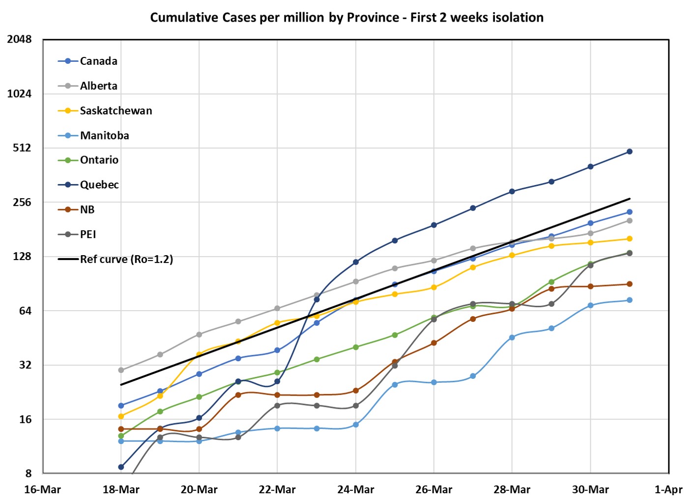
Let’s start back with our friend Ro…the growth rate of new cases. Remember that I divided all the data by the provincial population and multiplied by a million so that we can compare numbers directly. My public health friends look at populations per 100 000 so if you want those numbers, multiply my y-axis by 10. The overall slope on March 31, our friend Ro, was approximately 1.2 (the solid black line), but we really didn’t have enough data to see a change yet. Turns out it was there!
Here is the data for Saskatchewan after 4 weeks – and we definitely flattened the curve! Two things to see here: first, the data evolves slowly. Measuring slopes is harder than measuring a single number – we need 5 or 6 consistent data points to be sure that we are seeing a change. Second – changes to Ro make a big difference over time. By changing Ro from 1.3 (where we started) to 1.03 (where we are now) we dropped the number of cases by a factor of 10 after 10 days of growth. The log scale makes this hard to see, so I added a table with the numbers and the exponential growth equation so that you can try this for yourself. Key point: with exponential growth Ro gets an exponent of the number of days, rather the number of days being a simple multiplier like the slope of a straight line. This is good news for beer making and compound interest, bad for spread of disease.
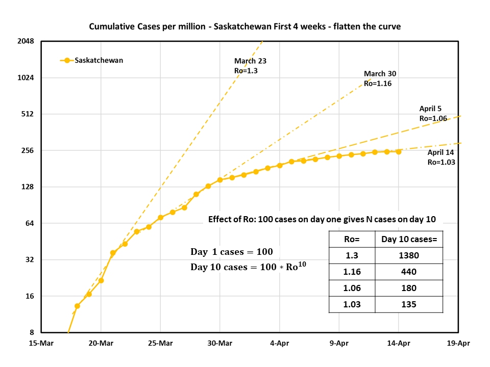
Back to Covid. This flattening is really good news since we started with about 140 ventilators in Saskatchewan, and each case that lands in critical care seems to need about 2 weeks to resolve. Buying time is saving lives. Moving fast made a big difference. Thank you.
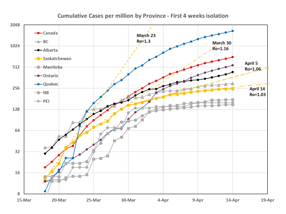
Looking across Canada, we can see this effect playing out very well in BC, Manitoba, New Brunswick and PEI (sorry NS – you’re not here). Quebec is really starting to struggle now as they passed the 500 cases per million people mark 2 weeks ago. It is not clear yet how things are going to land in Ontario and Alberta. This is another place where you can see the effect of changing Ro fast and early. If you compare the first plot for Canada with this one, you see that places which were able to move early and fast now have less than 250 cases per million, where Quebec (sorry!) is closer to 2000 cases per million. It would be easy to reignite this exponential wave, so just sayin’ – 10x is a big big number. Stick with it!
Let’s have a quick look at the global plot to see how the scary things happening in the UK and the US compare to numbers to Italy, Canada, China, and Germany (sorry France, Spain, and Brazil…you would have served just as well). Canada is sitting with an Ro of 1.05. I had a hard time comparing this to the other curves in the graph on this scale, but the US is clearly racing ahead. Note here that we have been talking about Italy flattening their slope, but their cases are still growing by several thousand a day – roughly 4x the number of new cases in Canada. This is another thing that log scales do. They squash the big numbers so that we can see all of the countries on one graph. ALL they tell us about is that important slope Ro – and they do that part really well. If I want to compare numbers, I always flip back and forth between the linear scale and the log scale just to remind myself what is going on.

Moral of the story: log plots give us the slope; to get a good slope measurement, you need a week worth of data. Try to avoid using log plots to understand the size of numbers.
Next up…and I knew we would have to get here…cases are hard to measure with limited testing…deaths are easier…and now we are seeing that when the “health care system breaks down” many medical staff get sick, testing is really hard to keep up with, and even deaths are hard to measure accurately. With that proviso, every human matters, so I want to switch to a linear scale for this last graph of the week.
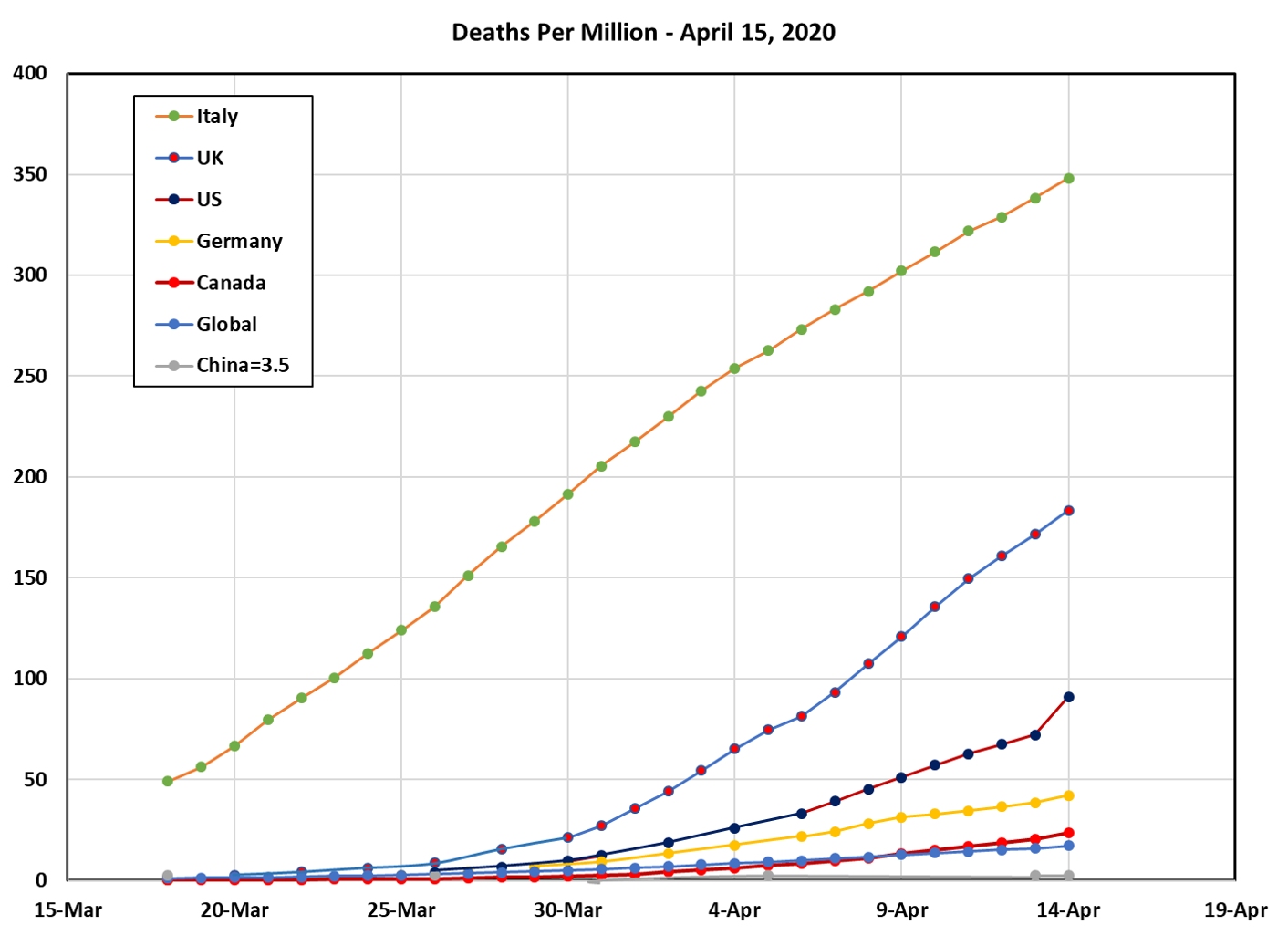
I found this quite horrifying, to be honest. Even though Ro started to flatten in Italy 2 weeks ago, the deaths are still increasing linearly and the numbers are huge. Spain and France are seeing similar impacts. Partly this is the nature of the disease: it takes at least 2 weeks after diagnosis to run its course in a critically ill patient – but these numbers have dropped out of the news cycle. A respectful note that each and every one of those deaths is a whole human being. A second note that Covid was the second leading cause of death in the US last week, having passed 9 others in one week. The US numbers only look small because they are next to Italy’s cumulative total.
Moral of the story: remember to use a linear scale if you want to see magnitudes – and ALWAYS try to find a number you understand to use as a benchmark. This helps put things in context so that you can make better sense of what you are seeing. (Note that this is something all of us have to do. Experience makes you remember how much it helps.)
It is really too early to tell where North American countries will. The data will evolve slowly, so I plan to take a break until we are 8 weeks in. I’ll work on better image quality for the next post as well…things are a bit busy these days so I hope these show up well enough to tell the story. Comments always welcome. I love to hear from all of you.