My vote for favorite image goes to Only in Canada…thanks for the meme!
March 31, 2020
The news in Canada…I am compiling Covid data tonight by province, because no-one seems to plot what I want to see…and the differences in news pages by province made me laugh:
- Alberta had the most amazing data, graphs, and full analysis. Seriously. A thing of beauty. Guess what? They have a large population of engineers.
- PEI gave me all of the Premier’s speaking engagements and what the talking points were for the last two months…and full social resources.
- Manitoba, Saskatchewan, and NB made me work for my numbers, but I was able to pull them out of a series of news conferences.
- Ontario provided an appendix breaking down the countries of origin of all of the travel cases, perhaps setting us up for conspiracy theories. They also broke down the cases by region and gave me the new cases for today, but no historic numbers to be found. (What?? We are hiding critical data? …refer to sentence 1? Am I missing something? Help me out here…)
- Quebec and PEI provided only the total cases for today, with an emphasis on how many cases have been successfully resolved. Apparently new cases are not of interest, and neither is the past. We live in the moment. I understand the Premier of Quebec also makes a point of thanking a different group of people each day at the beginning of his public address – in a personal and meaningful way. This is clearly a good thing.
We truly are a richly diverse country. I am still laughing.
How will I ever make sense of the missing numbers??
(I eventually found them on the national site, with thanks to StatsCan and Public Health Canada.)
April 1, plotting the data and introducing our new friend, Ro (Arrrr Naught!)
So…here is my data from yesterday. Apologies if you live in a province where I don’t have any family members…you are not listed.
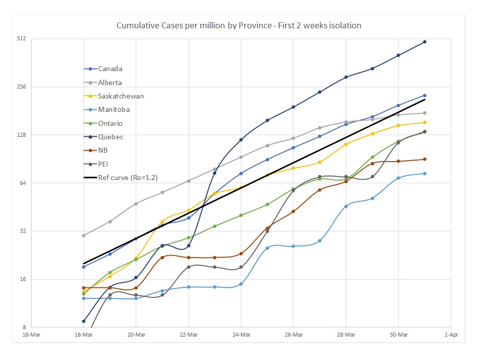
Because I want to see relative amounts of infection, I plotted everything per million people. Lots of noise here when the numbers are small (like tiny PEI and my Mom’s nursing home), but it tells us how likely it is that our loved one may be exposed in their own environment. Manitoba is an island of sanity delayed in their infection – and a shout out to Petr for all that testing infrastructure and long hours to mobilize everyone…!
Alberta is testing vigorously, as is SK, and it looks like we are starting to flatten the curve there. Shout out to Andree working hard at public health in NB for having an impact there with a valiant team of hard working colleagues!
Note the blip when Quebec changed their case confirmation threshold on March 22, and then how their slope quickly went back to reflecting what is going on in the rest of the country. Welcome home Rebecca and thank you for copious hand washing on the way back!
The important thing here is slope (Ro), so I also plotted things on a log scale, and made it log(base 2) because our numbers are still pretty small. You can see this on the y-axis because every step comes in multiples of 2 (8, 16, 32, etc.).
Ro is the multiplier on the total cases per day to get tomorrow’s cases. When the slope goes to zero (flat line) there are no new cases and restrictions start to get lifted. That is Ro=1. China is there now and Italy is getting closer… Canada is at Ro=1.2 right now (the thicker black line). The US started at 1.36. The difference is that we started isolating earlier.
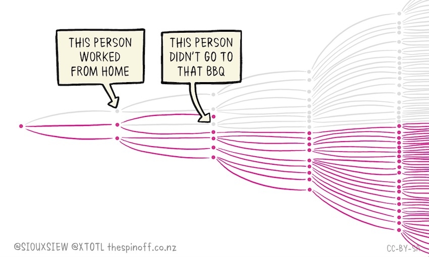
If this seems like a small difference in numbers, let’s start with 100 cases. After a week, Ro=1.36 gives us 860 cases. Ro=1.2 gives us 360 cases. Less than half the spread. The cartoon below shows why all of our choices matter. Yowsa. Those epidemiologists and public health folks might be giving us good advice!
Why isolating matters – a short video
Here is an alternate link (for those who self-isolate from facebook) to the awesome Kiwi @SiouxSieWiles at The Spinoff


